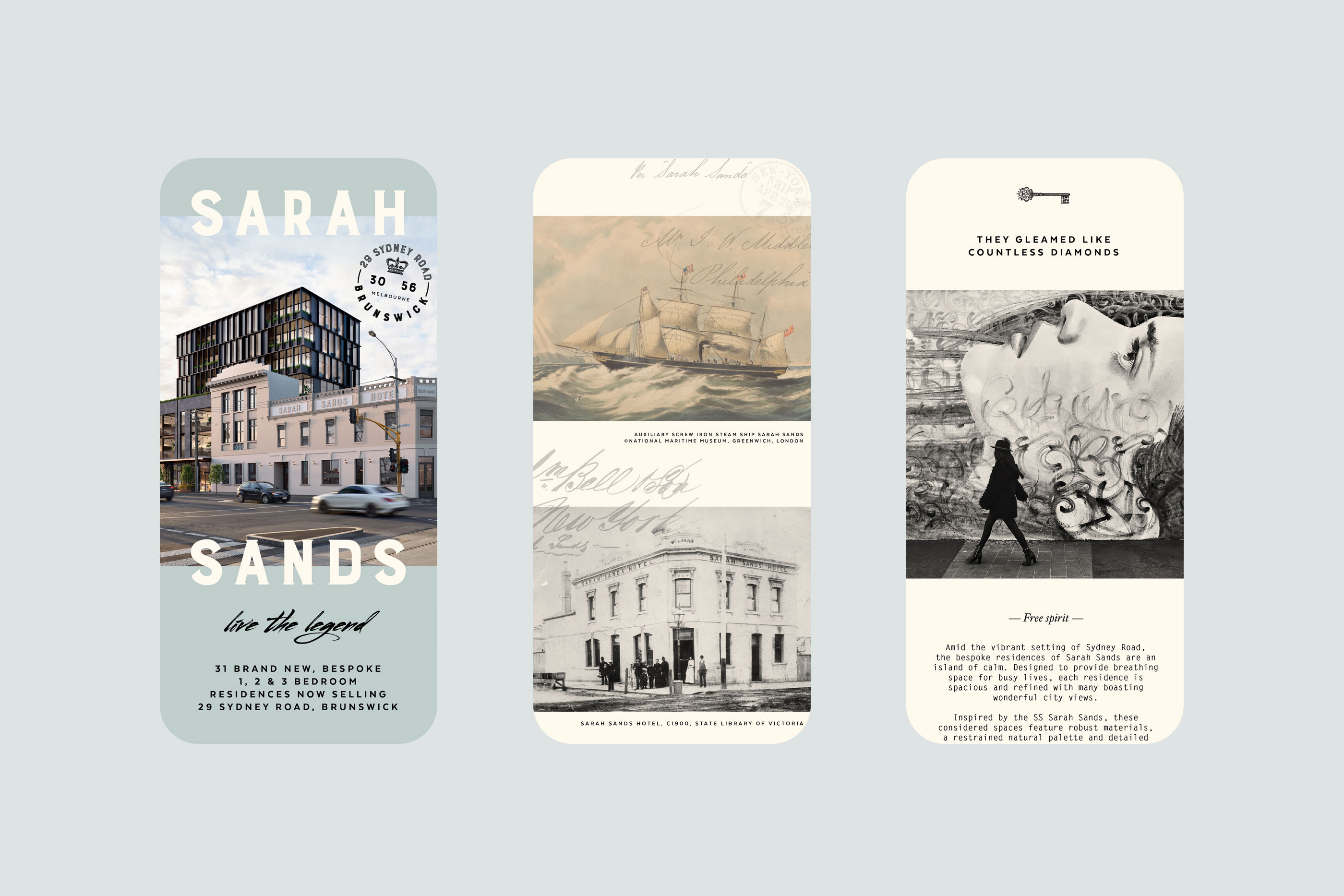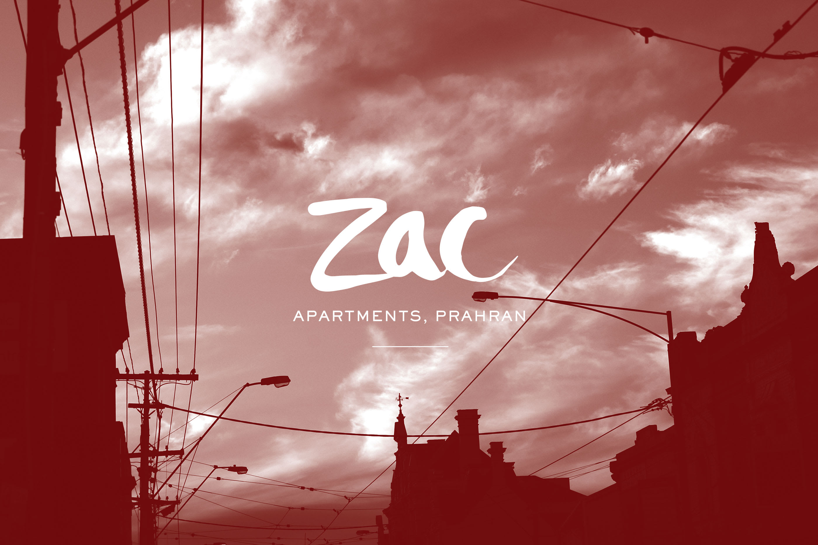

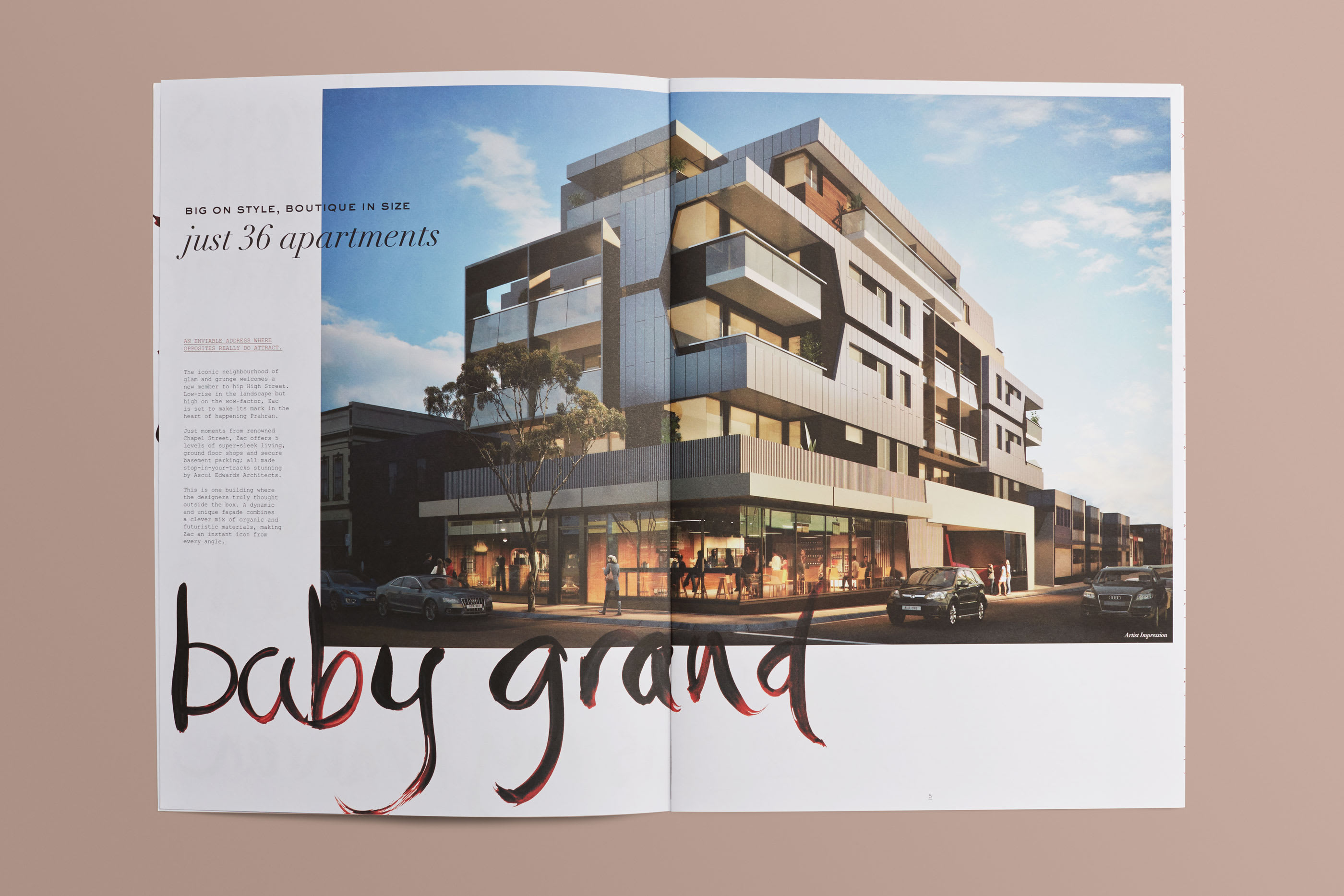
Where opposites attract
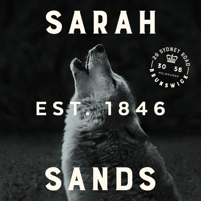
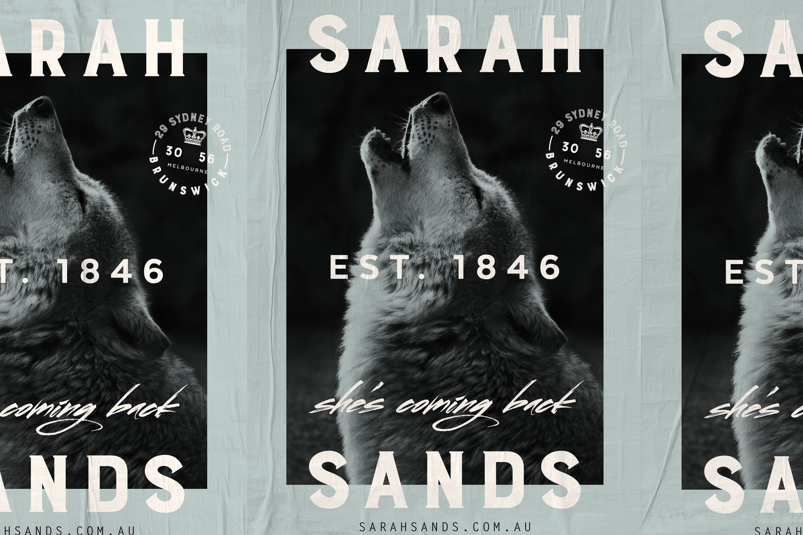
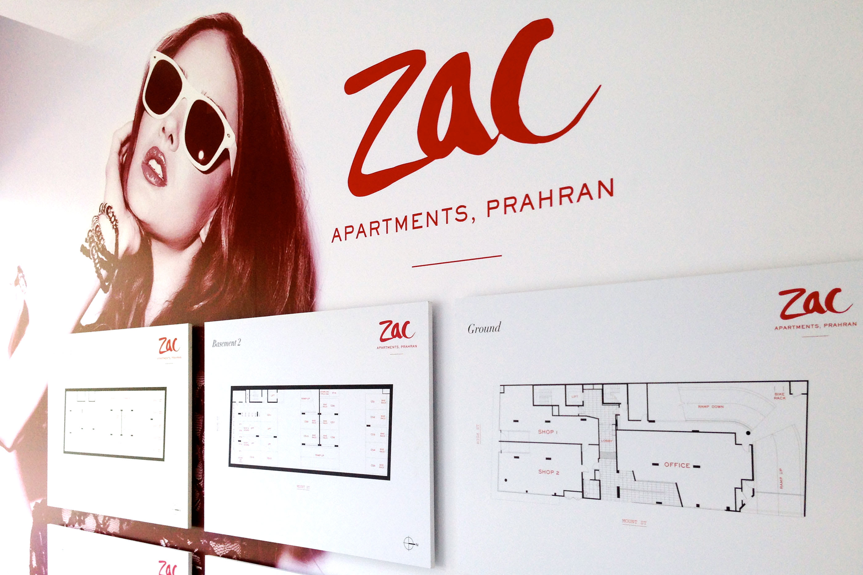
ZAC, PRAHRAN
PEREGRINE PROJECTS
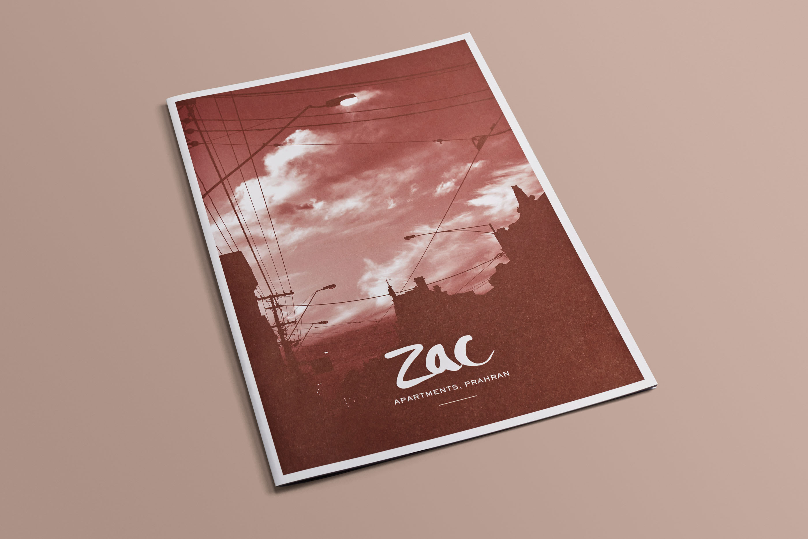
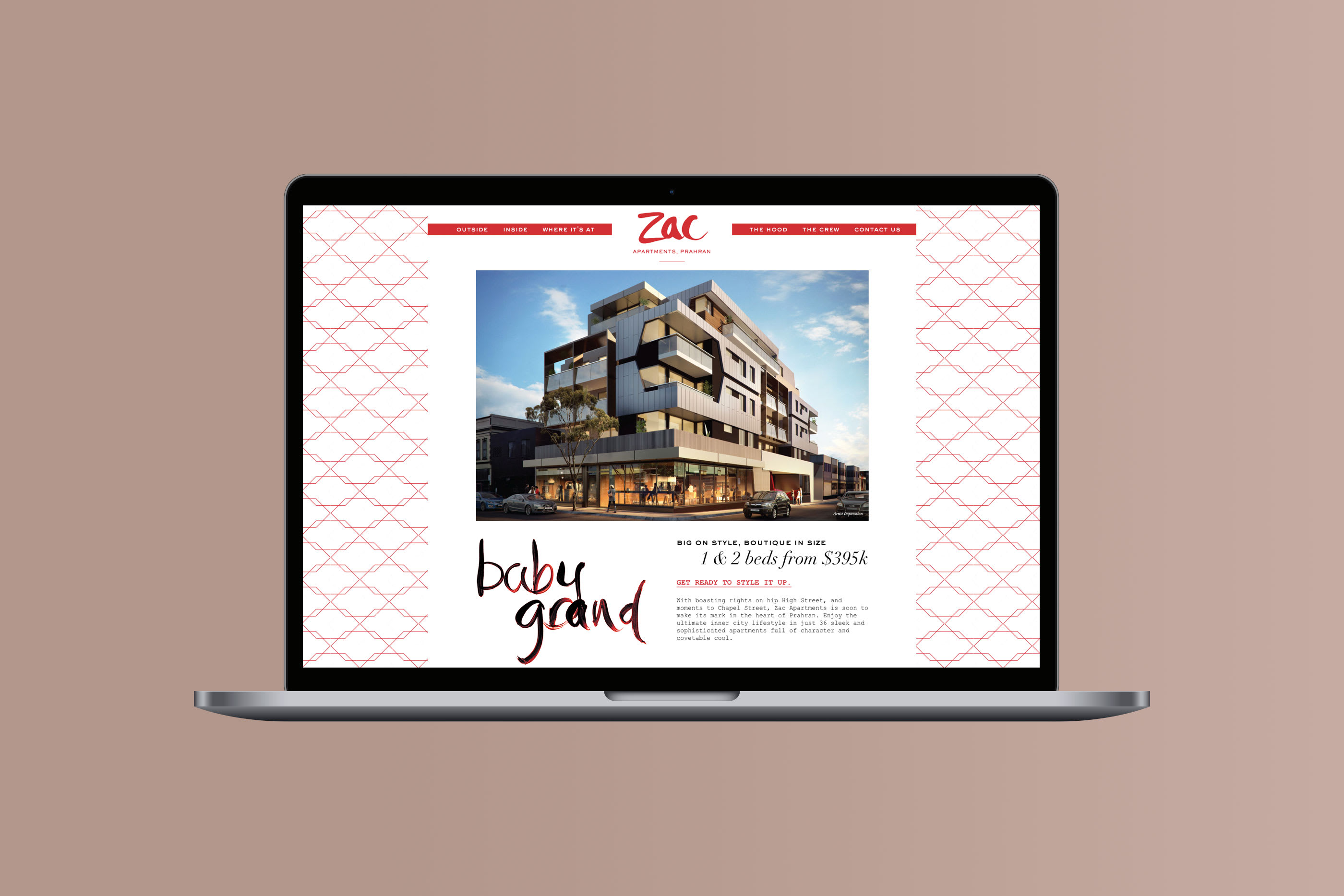
Big on soul,
boutique in size.
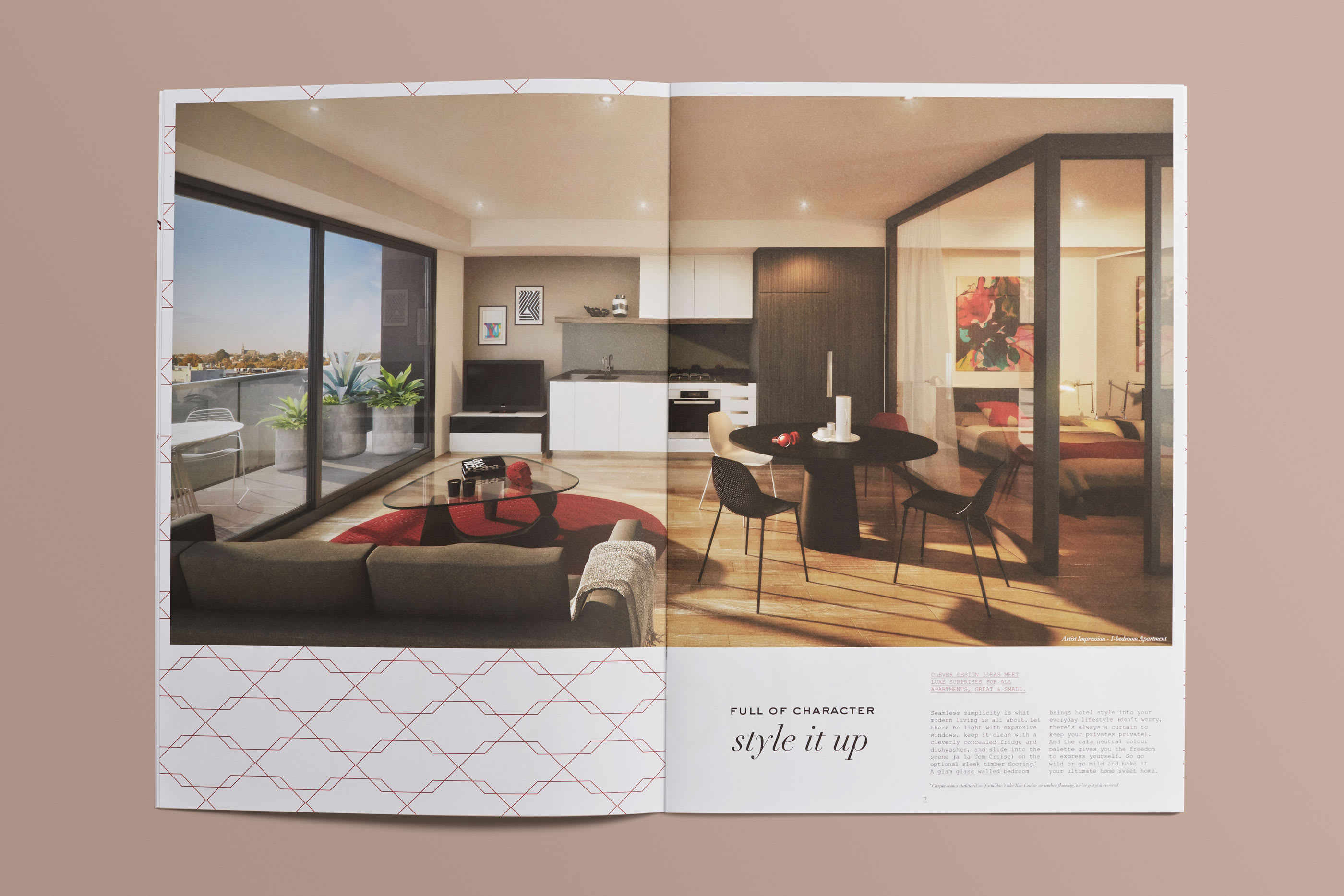
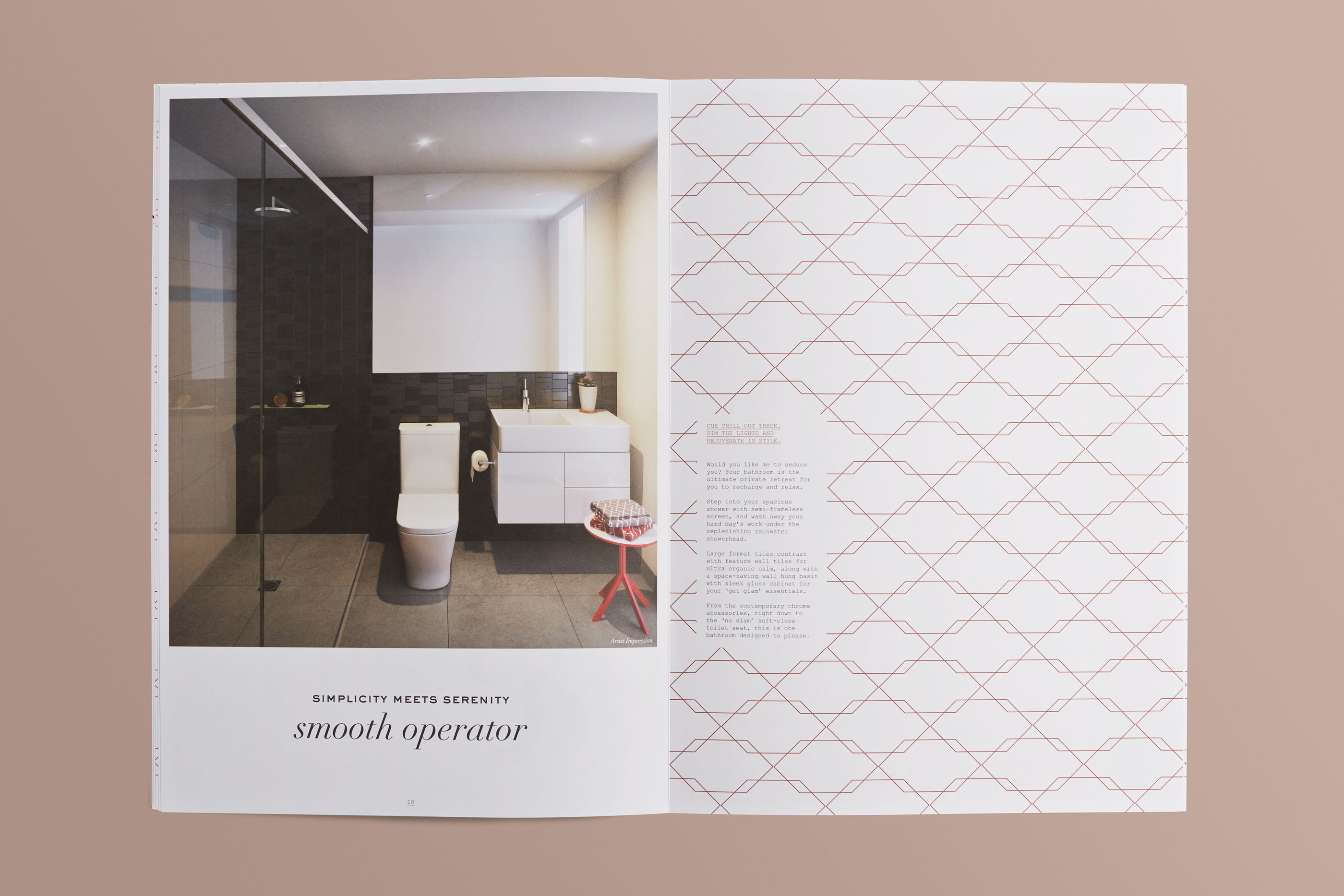
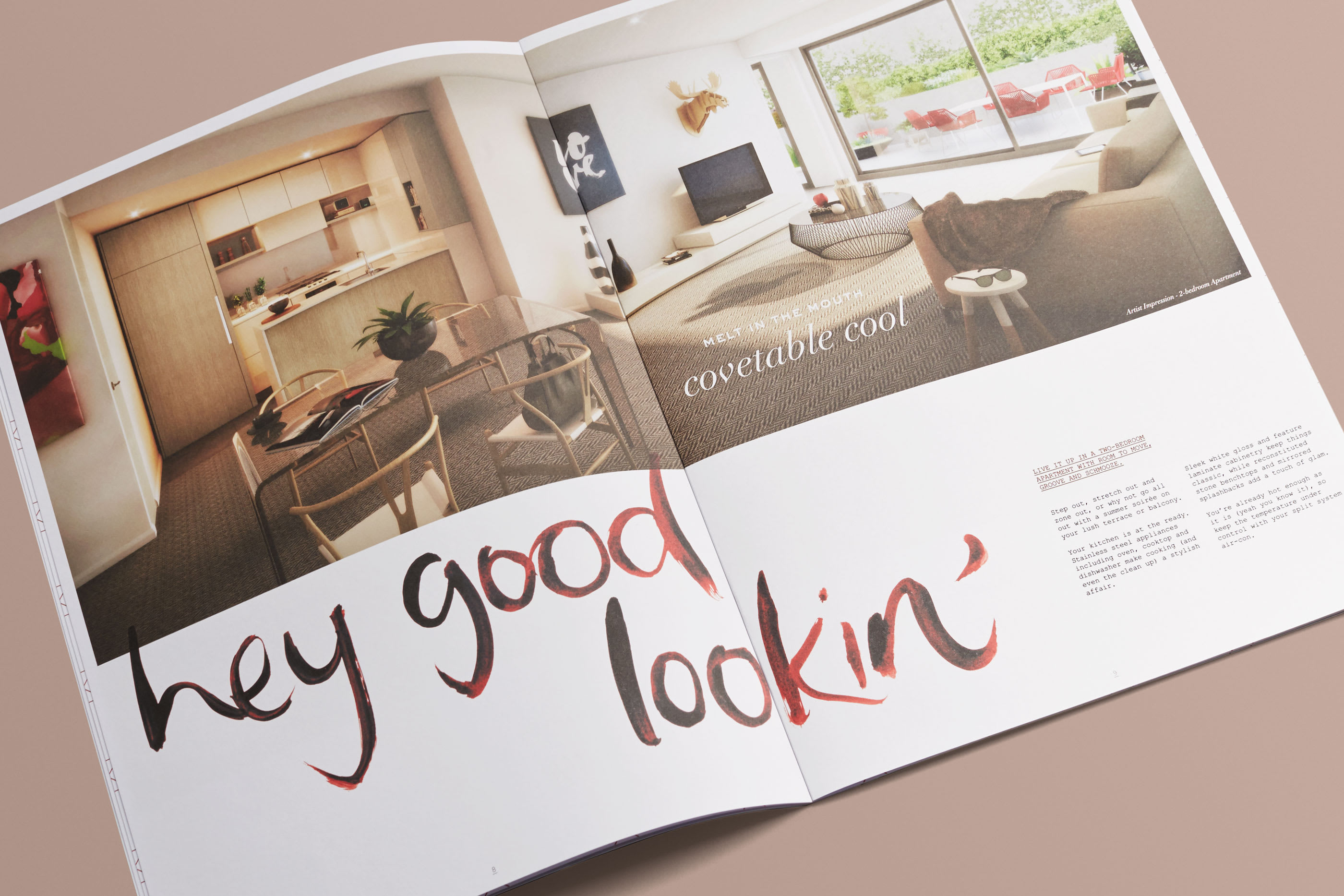
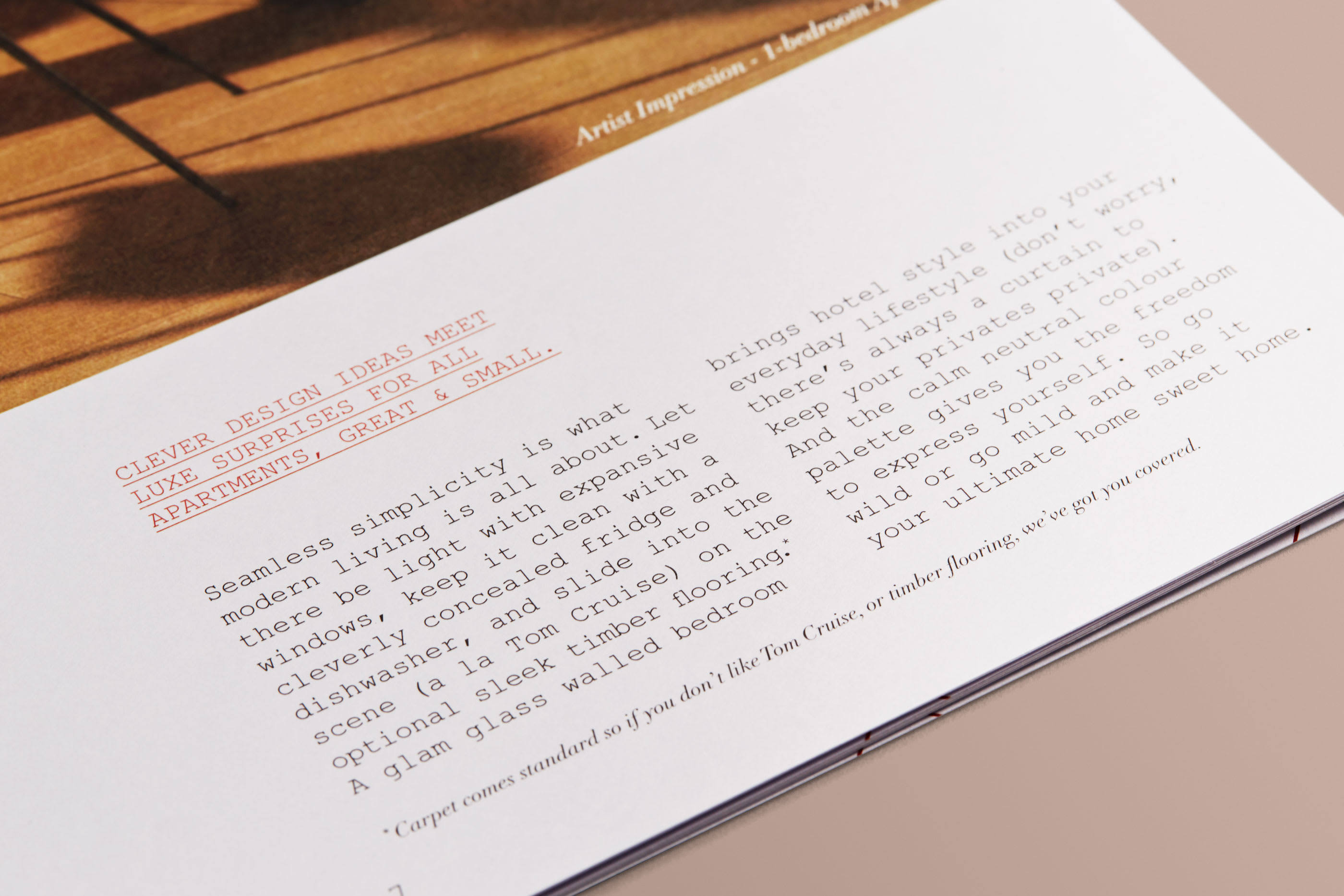
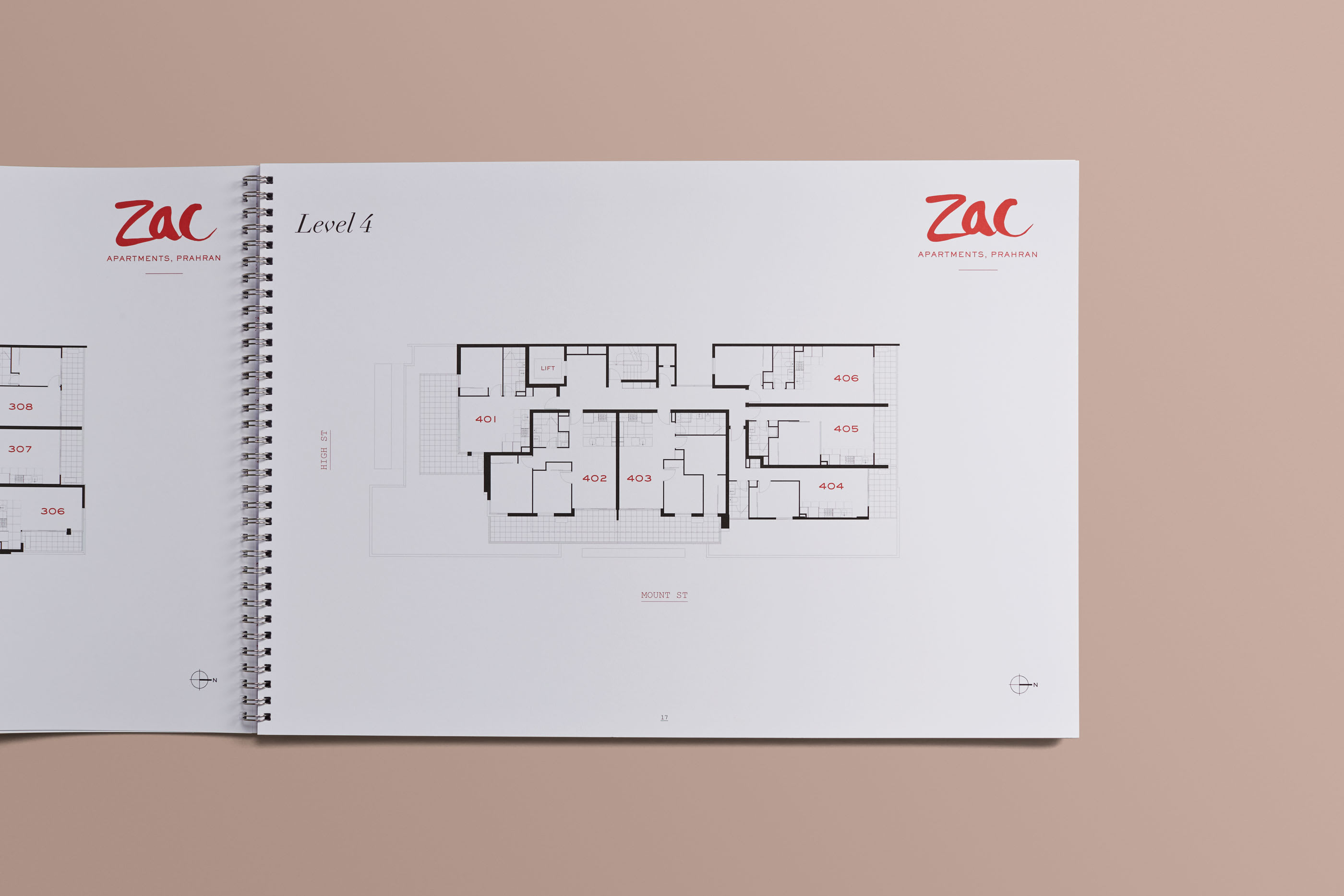
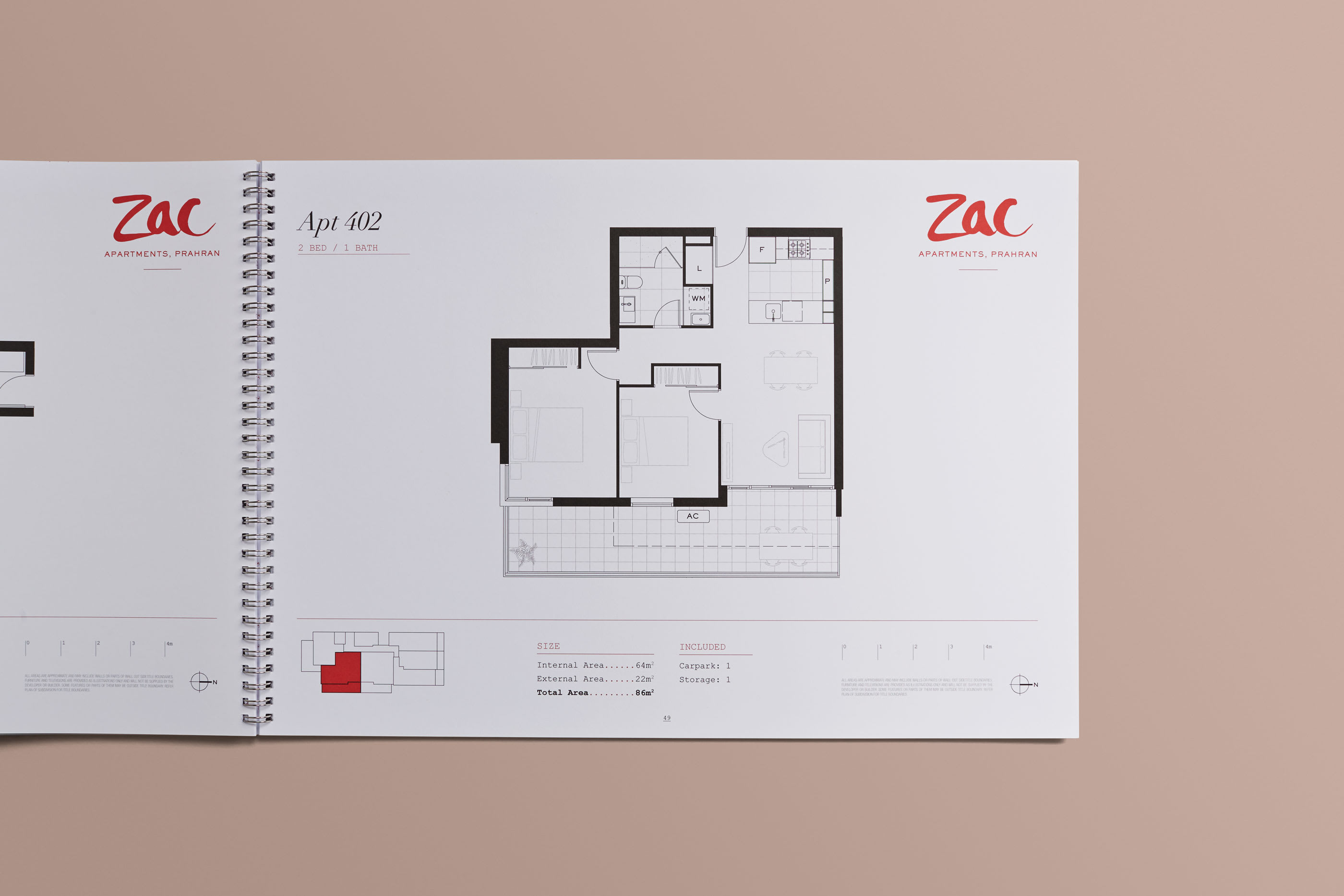
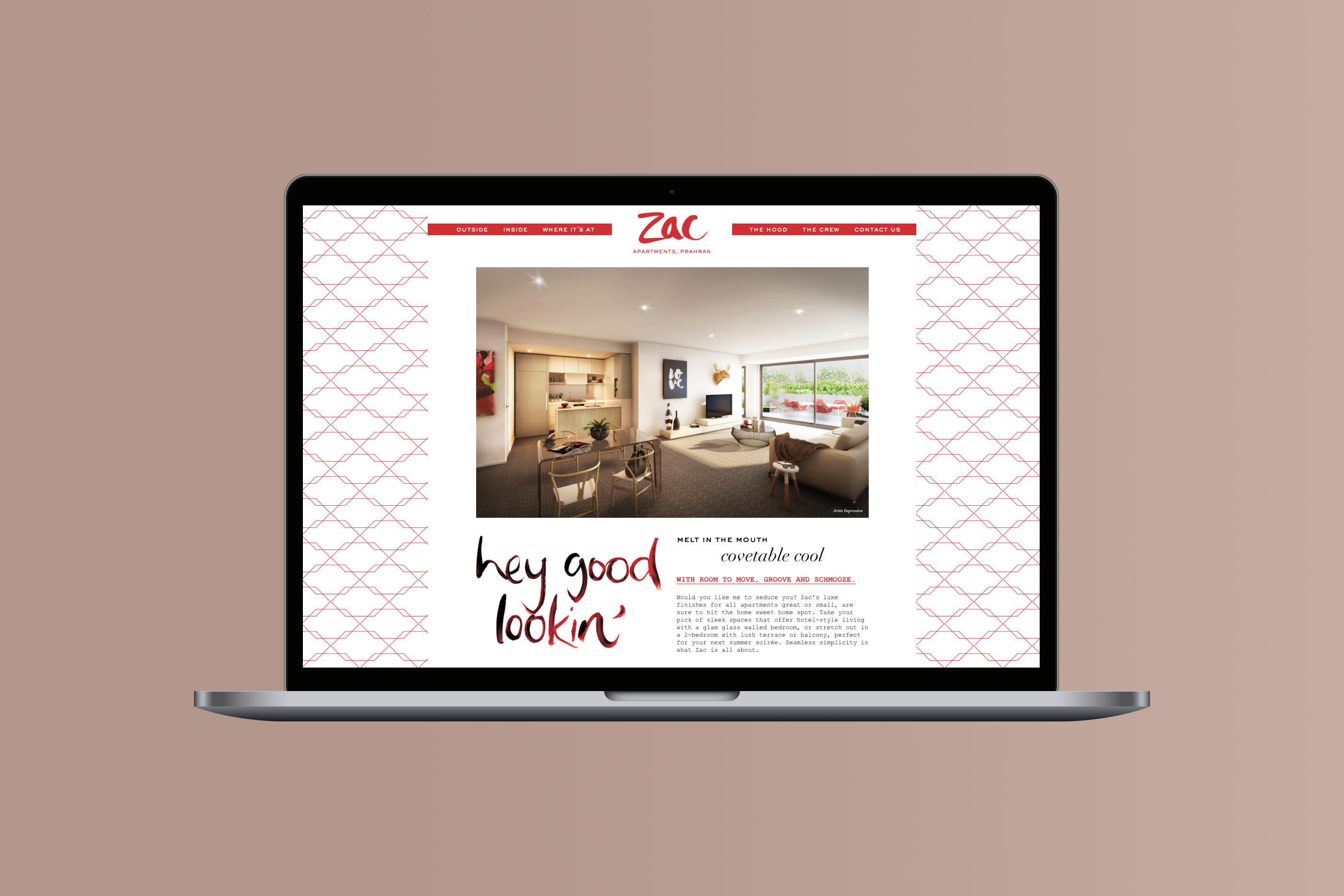
Peregrine Projects’ 36 apartment development required a bold campaign for a modest budget. Positioned just moments from Chapel Street in Prahran, Ascui & Co. Architects design featured clever ideas and luxe surprises for all apartments, great and small.
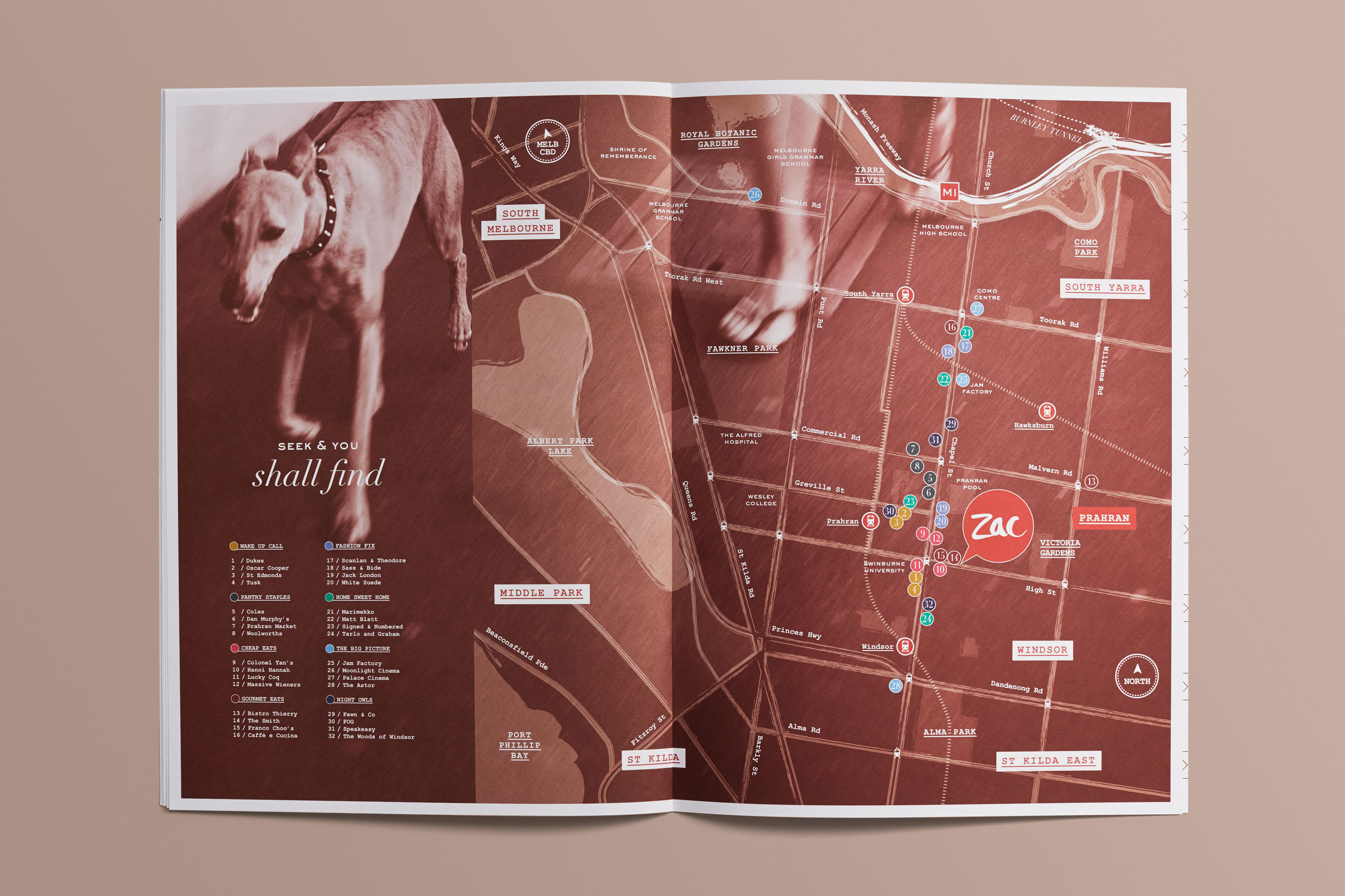
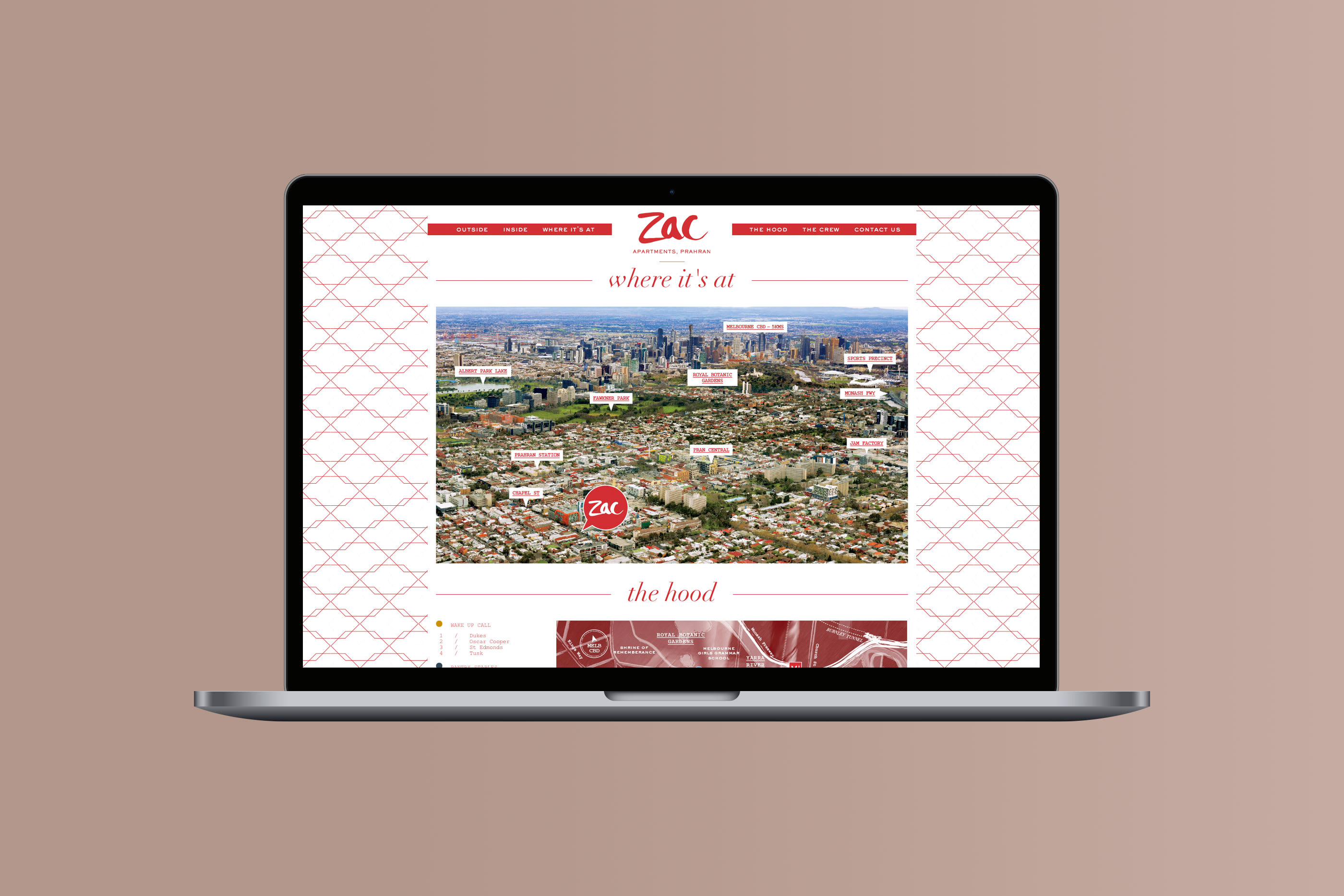
Inspired by the urban neighbourhood, Claire tapped into Prahran’s true spirit – a mash up of glam and grunge. A place where opposites attract and an address locals are proud to call their own.

In naming the development, Claire imbued the brand with a clever mix
of youth and cool. Zac gets Prahran and Prahran gets Zac.

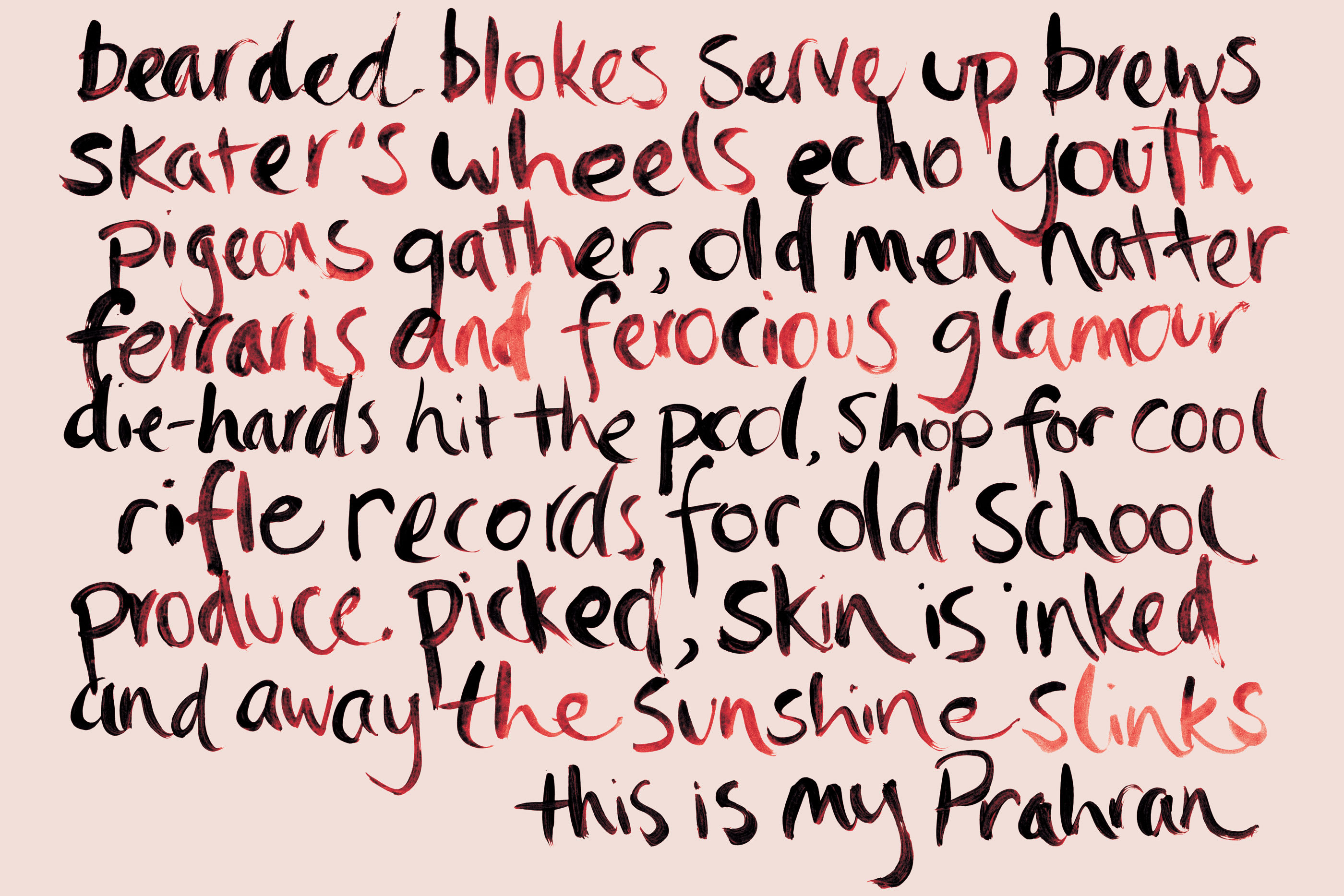
Claire wrote a poem as the brand manifesto for the project along with playful headlines that evoked
a sense of place and pride.
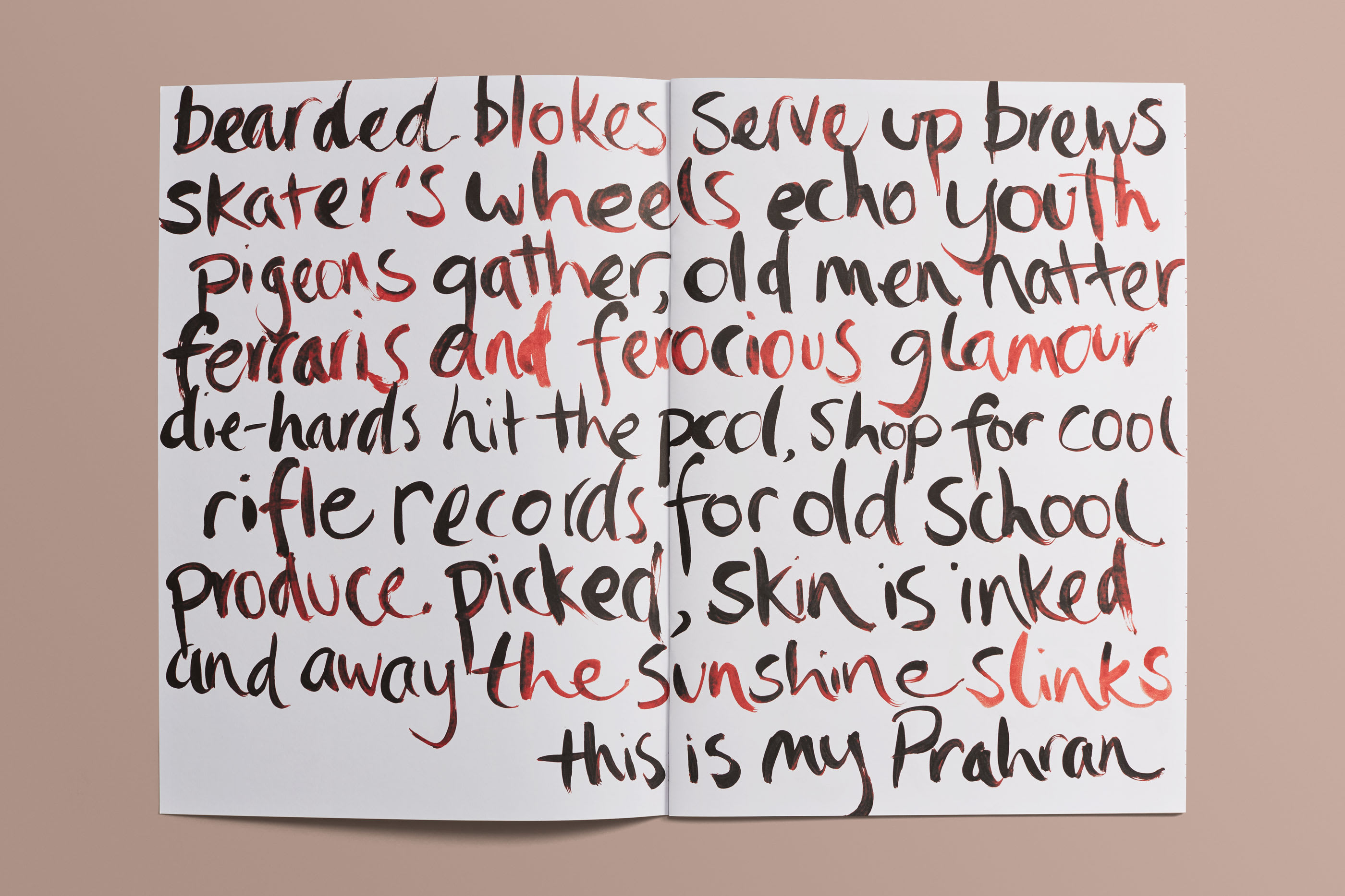

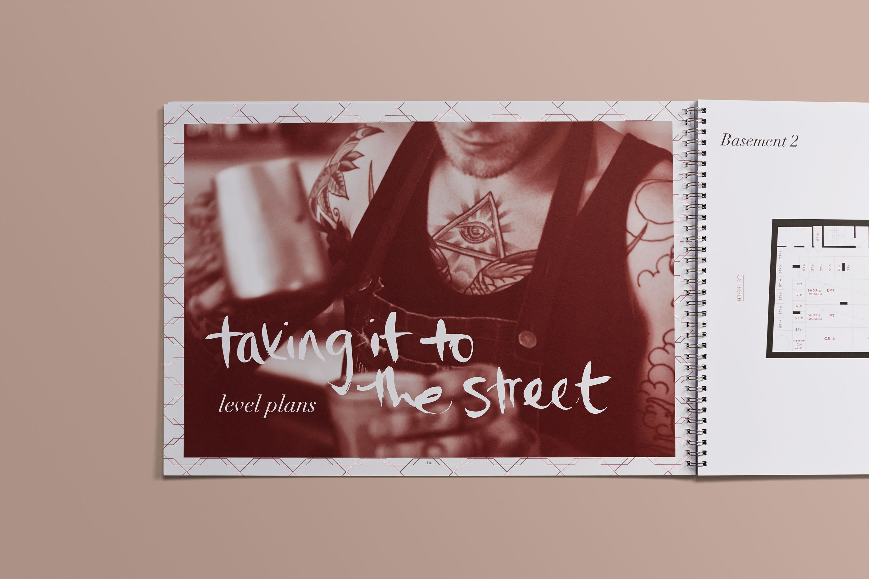
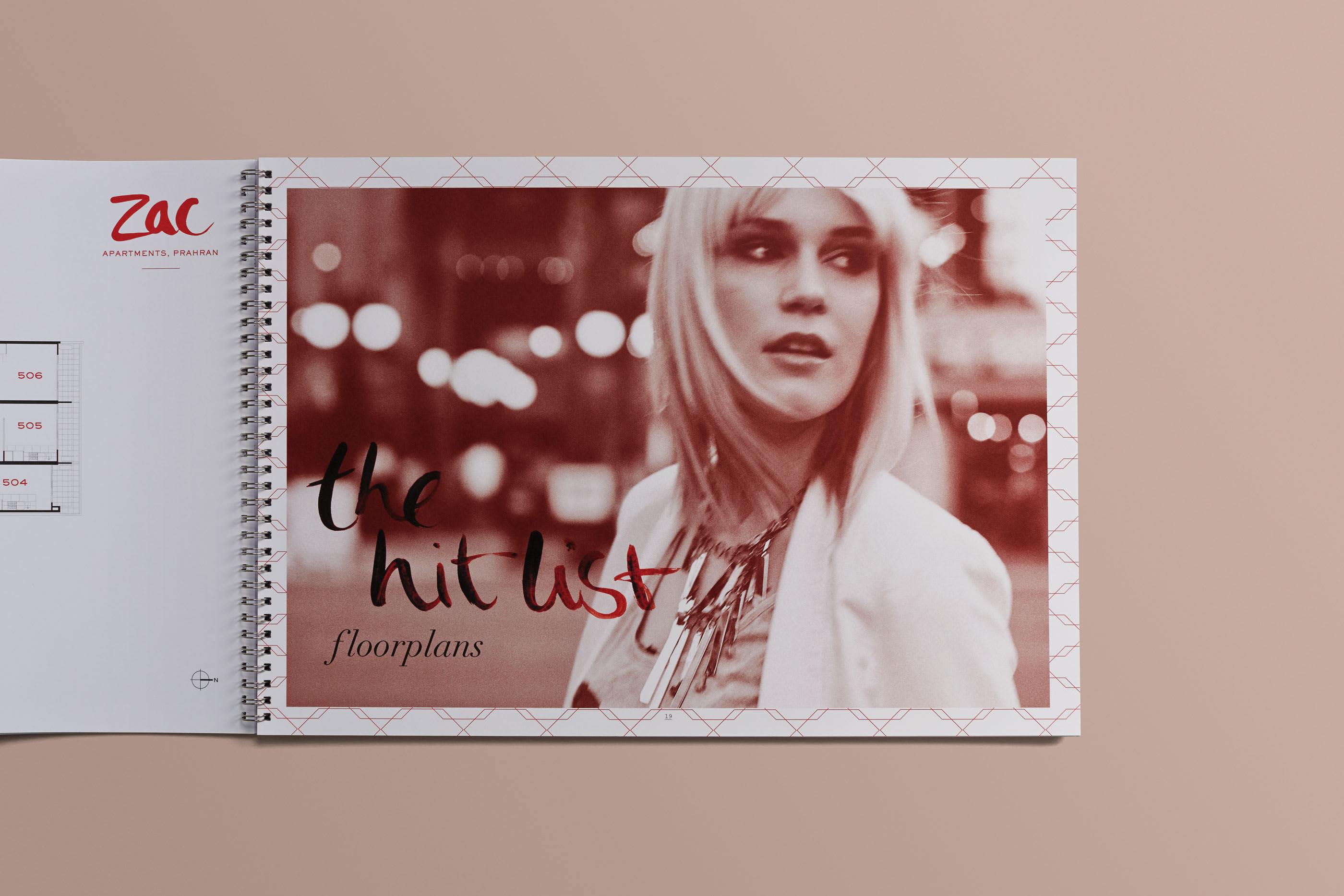
Hand lettering the typography, Claire created a one-of-a-kind typeface rich in personality
and raw energy.


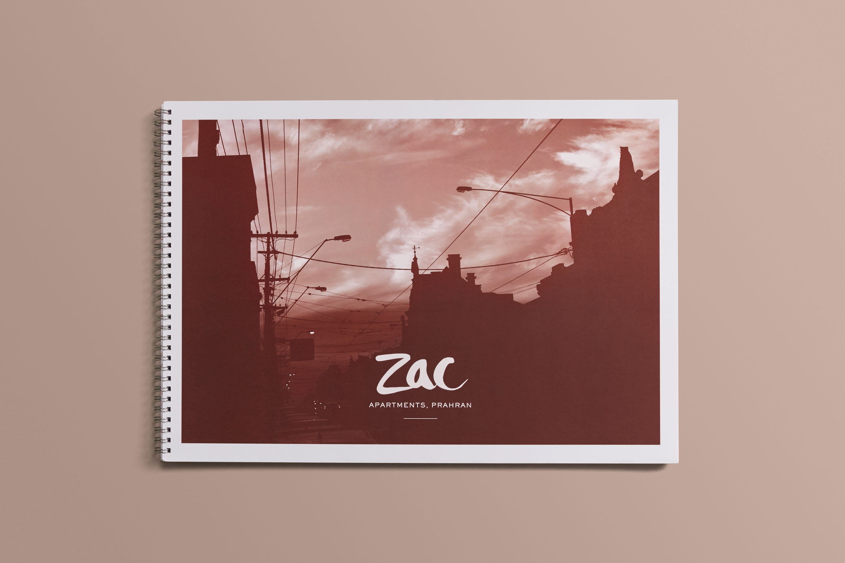
Teamed with a bold
red palette, local photography and pattern inspired by the façade, Zac stood
out from the pack.


CREDITS
Concept, Creative Direction, Design, Poetry and Handlettering: Claire Skinner
3D Rendering: Scharp, Location Stills Photographer: Andrew Vukosav, Copywriting: Julie Wallace, Printing: Bambra Press, Paper: Spicers, Display Suite Signage: Sign Group Australia, Folio Photography: Visual Thing
Claire created and designed this brand at her former agency Catalyst.